helloDojo — Customer App

Outcome
- 3
- Interaction modes Voice, Chat, UI Flow — one booking engine
- 6 mo
- Discovery to TestFlight End-to-end product + implementation
- 4
- Service categories Rideshare, dining, yachts, nightlife
- Beta
- TestFlight status Private beta, production-ready
On this page
Select a section
One-line impact
Designed and built a production-ready customer app that unified rideshare and multi-category bookings through an agentic interface, three distinct interaction modes, and intelligent event connection logic—proving that voice-first booking could be premium, flexible, and technically feasible.
Snapshot
Executive summary
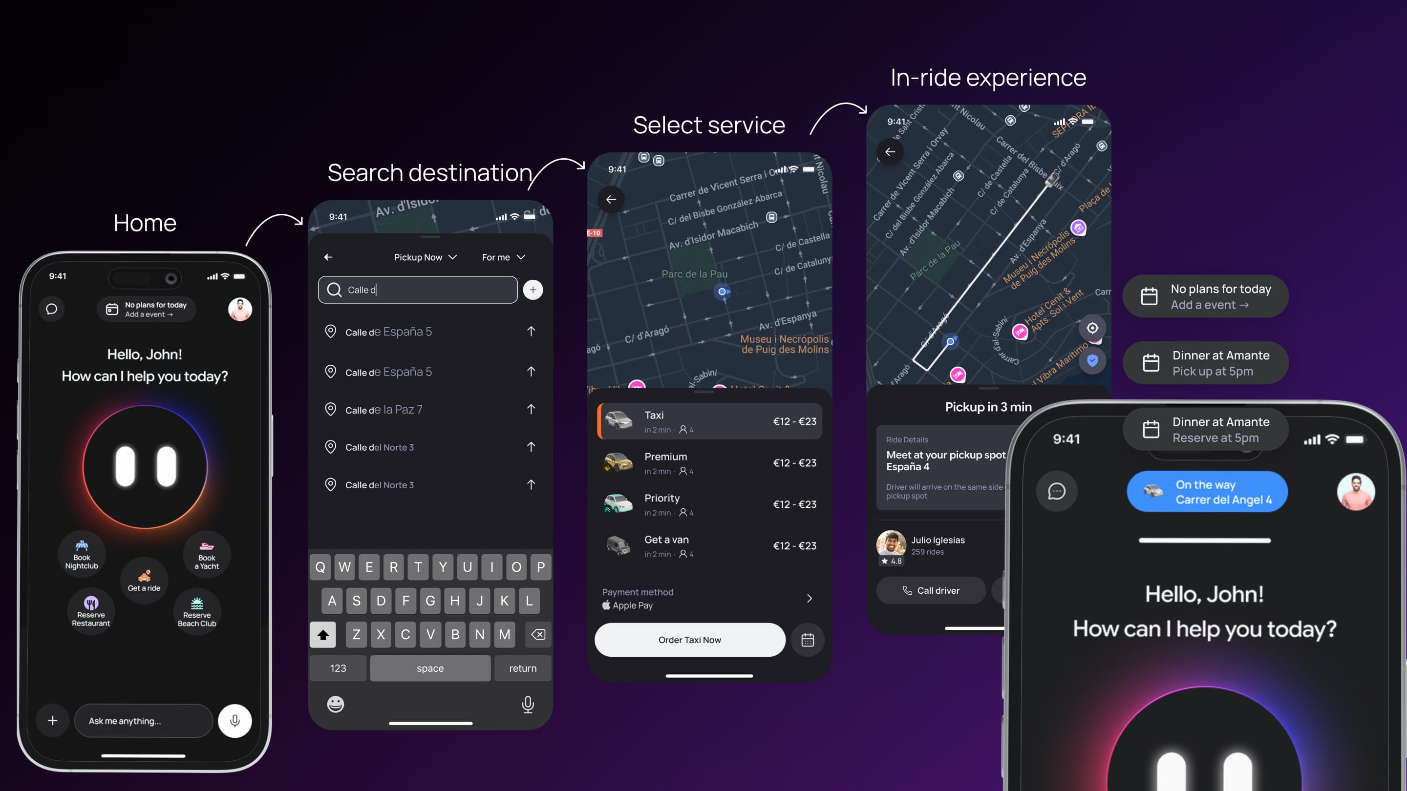
The Customer App was the core of helloDojo's product. It unified rideshare, restaurant bookings, yacht reservations, beachclub reservations, and nightlife experiences under a single interface powered by Dojo, an agentic AI concierge. My role was to translate the strategic insight—"agent-focused, not just another Uber"—into a functional, production-ready experience. I designed three interaction modes (Voice, Chat, UI Flow) that served different contexts and user preferences, all connected by the same underlying booking and event logic. Most critically, I solved a complex product problem: intelligently connecting consecutive bookings across the app's calendar, automatically suggesting rides between events and merging event cards when rides were booked. In 6 months, working closely with the CTO, I shipped a fully functional app with real-time rideshare tracking, voice interaction with tool calls, and a calendar system that understood user intent across multiple service categories.
Voice Mode
Hold-to-talk, premium hands-free. Dojo speaks back and shows option cards beneath the avatar — same conversation continues whether you tap or speak.
Chat Mode
Same flow as voice, written. For loud clubs, hearing accessibility, or just preference. Option cards drop in below each Dojo reply.
UI Flow
For users who want to browse all 50 restaurants before deciding. Stepped, filterable, elevated visual treatment — still routes through the same booking engine.
Context
The Customer App was helloDojo's primary product. It needed to solve Ibiza's core hospitality problem: fragmented booking experiences where users juggle multiple apps, phone calls, and WhatsApp conversations to book taxis, dinners, yachts, beachclubs, and nightlife experiences.
The strategic direction was clear from the start: Don't be another Uber clone. Instead, make Dojo—an AI concierge—the primary interface. Users should feel like they're talking to a capable concierge who understands their night, not tapping buttons in a transactional app.
But this raised a product challenge: If voice interaction is the differentiator, how do you make it work when users are in loud clubs? How do you show complex options (restaurant availability, pricing, cuisine) through voice alone? And how do you make the app intelligent enough to understand that a user booking dinner at 10 PM might need a ride there, and then another ride to a second venue at midnight?
The Customer App had to solve all of that.
Problem statement
User Problem
Users in Ibiza needed a faster and more connected way to manage their nights, from booking taxis and reserving venues to coordinating yachts, restaurants, and beachclubs without jumping between multiple apps or making phone calls. The experience had to work in noisy, fast-moving environments like clubs, villas, and boats, where convenience and speed mattered more than traditional interaction patterns. Existing platforms like Uber, Resy, and Booking solved isolated problems but lacked contextual awareness between activities, forcing users to manually coordinate rides, reservations, and schedules themselves.
Business Problem
helloDojo needed to build a Customer App that felt differentiated enough to justify a new app install while still being operationally scalable across rideshare, bookings, payments, and real-time tracking. The platform also needed to create enough consumer demand to attract venues and vendors into the ecosystem. The biggest risk was positioning: if the experience felt like just another Uber clone, users would have no reason to switch, but if the voice-first interaction model failed in real-world noisy environments, the product’s main differentiator would collapse.
Product Problem
The core product challenge was designing a multi-modal experience where users could seamlessly switch between voice, chat, and traditional UI flows depending on context. The system needed to maintain conversational interaction while still surfacing complex booking options visually, understand relationships between consecutive bookings across an entire night, and intelligently suggest rides between events. At the same time, the app had to support real-time rideshare tracking, calendar-based planning, and reliable interaction patterns for users operating in loud nightlife environments where voice alone was not always viable.
User problem
Tourists and locals need rides, dinners, yachts, tables — but the system runs on insider connections, scattered apps, and language-blind concierges.
Business problem
Capture transaction volume across rideshare and dining before competitors land. Half-baked or fragmented = failure in an image-conscious market.
Product problem
Unify radically different service categories (instant rides, advance bookings, payments, logistics) under one experience — without overwhelming or fragmenting.
Role & Responsibilities
I led the full product definition and execution of the helloDojo Customer App, owning product discovery, UX architecture, interaction design, design systems, and frontend implementation. As the sole designer, I worked directly with the CTO to translate business and product intent into scalable technical requirements, while managing the entire design-to-code workflow through AI-assisted frontend development.
My work included designing the complete multi-service experience across rideshare, restaurants, yachts, beachclubs, nightlife, and the calendar/event system, while defining how users moved between Voice Mode, Chat Mode, and traditional UI flows depending on context. I also designed the core event connection logic that intelligently linked bookings together, suggested rides between destinations, and transformed the calendar into a contextual planning system rather than a static schedule.
On the implementation side, I created the Customer App design system, including components, tokens, responsive behaviors, and interaction patterns tailored specifically for the app experience. I then built the entire frontend in React using AI-assisted workflows with Cursor and Figma MCP, ensuring visual consistency, interaction quality, and alignment between product design and production code across all interaction modes.
Constraints
No user research
The CEO validated rideshare demand for Ibiza, but experience bookings (restaurants, yachts, beachclubs, nightclubs) were an educated guess. I designed without user testing.
Technical unknowns with voice
Text-to-speech latency, speech-to-text accuracy in noisy environments, fallback UX for ambiguous commands—all had to be solved in design.
Complex event logic
The connected booking system (detecting consecutive events, suggesting rides, merging cards) required tight coordination with the CTO and clear product definition upfront.
Real-time performance
Rideshare tracking, real-time driver location updates, instant state changes—all had to feel smooth on mobile with variable network conditions.
Three modes, one codebase
Voice Mode, Chat Mode, and UI Flow had to share components and logic while feeling visually and behaviorally distinct.
Parallel product pressure
The CEO wanted rideshare + dining + yachts + beachclubs + nightclubs launched simultaneously. No phased approach. All five service categories shipped with the app.
Team size
Just me (design + frontend) and the CTO (backend). No dedicated QA until two weeks before the project paused. No product manager. Decisions were fast but also high-risk.
Product strategy
The work was guided by one core insight: Agent focus means three modes, not one.
The initial instinct was voice-first. But designing for Ibiza's context—clubs, beaches, villas, nightlife—meant recognizing that voice alone wouldn't work everywhere. Loud venues, hearing loss, user preference, social context (not wanting to talk in a quiet restaurant) all meant users needed alternatives. But the alternatives couldn't feel like a fallback. Chat Mode and UI Flow had to feel like equal choices, not degraded versions of Voice Mode. All three modes needed to access the same booking engine, the same logic, the same options.
Agent interface as the mental model
Whether you speak, type, or tap, you're interacting with Dojo. The mode is the channel, not the product.
Tool calls as UI
In Voice Mode, when Dojo needs to show options (restaurants, drivers, pricing), those appear as UI cards below the avatar. The conversation continues.
Calendar as service logic
The app understands that bookings are events, and events create demand for rides. If you have dinner at 10 PM and a club at midnight at different locations, you need rides.
Real-time as a baseline
For rideshare (the most time-sensitive service), users needed live tracking. Anything less felt broken.
Accessibility as primary, not secondary
Three modes wasn't a nice-to-have; it was the business model. Voice mode proved differentiation. Chat and UI modes ensured the app worked for everyone.
Key decisions
| Decision | Why it mattered | Trade-off |
|---|---|---|
| Three interaction modes (Voice, Chat, UI Flow) | Users in loud clubs can't use voice. Users with hearing loss need alternatives. Users who want to browse all options need UI. Supporting all three modes kept the app usable across contexts while preserving the agent-first positioning. | Increased complexity: three distinct flows, three visual treatments, three state machines. More edge cases. More testing needed. |
| Tool calls as UI cards in Voice/Chat modes | Pure voice without visual options creates ambiguity ("Did the system understand me?"). Showing restaurants, pricing, availability as cards while maintaining conversation flow gave users confidence and control. | Risk of splitting attention between voice/text and UI. Required careful visual hierarchy to keep Dojo and conversation primary. |
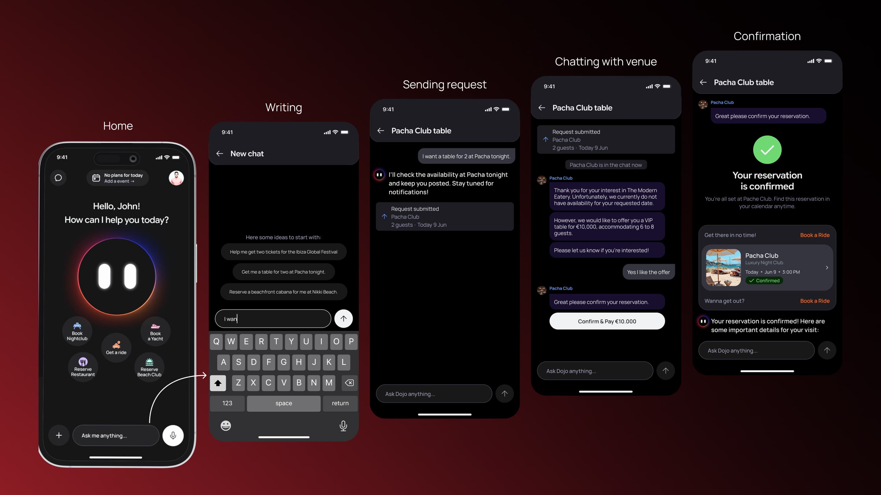
| Connected event logic—automatically suggest rides between bookings | Users booking dinner then nightlife needed rides between venues. Rather than requiring two separate ride requests, the system detected the pattern and suggested "Your next reservation" as a destination. Made the app feel intelligent. | Complex product logic that required tight CTO coordination. Had to be defined upfront; changing it mid-build would break everything. |
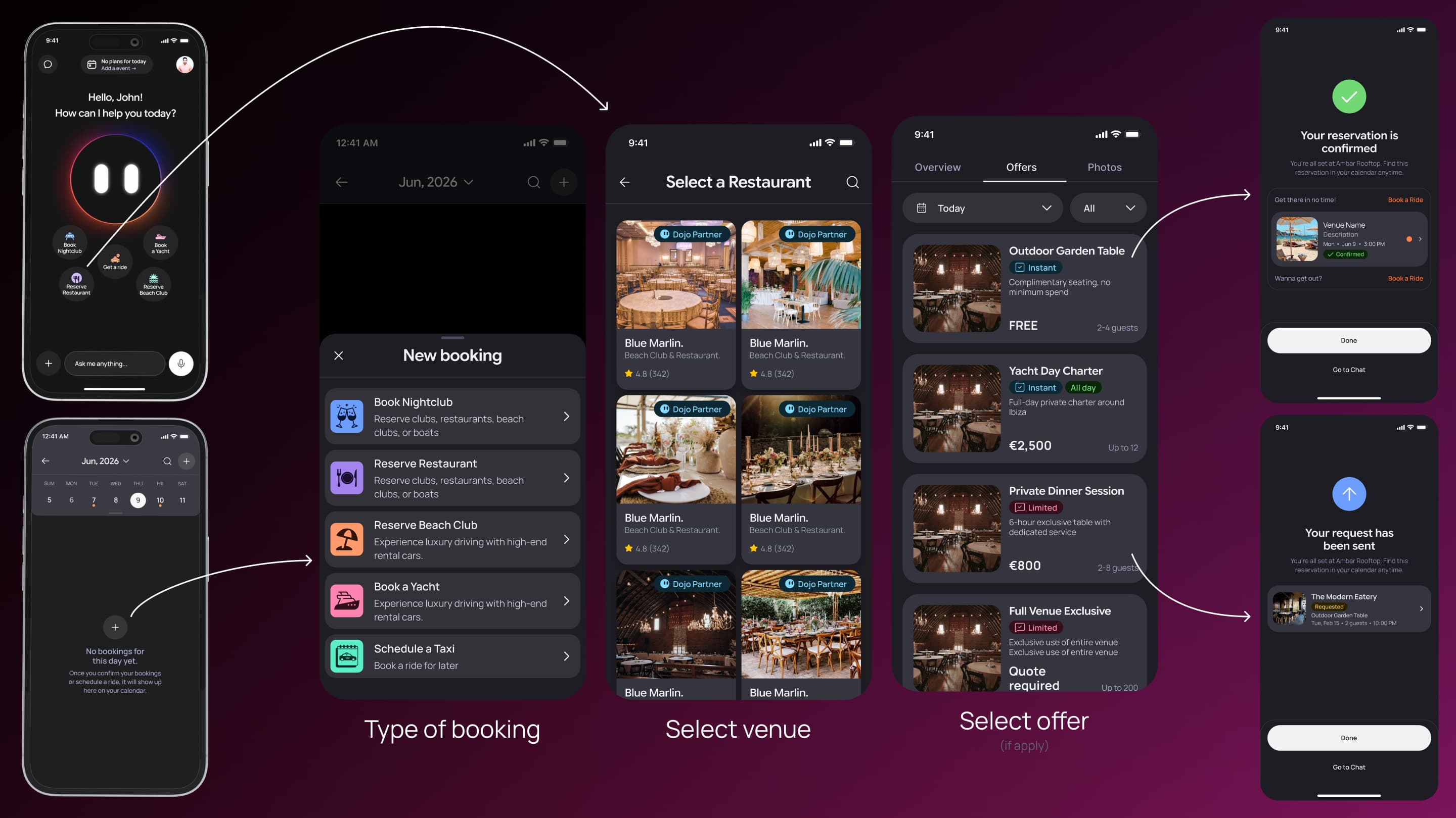
| Calendar as the organizational model, not service categories | Instead of "Rideshare" tab, "Restaurants" tab, "Yachts" tab (like Uber, Resy, separate apps), all bookings lived in one calendar. Events were events. Rides connected events. This unified the experience. | Lost some service-specific context. A restaurant booking and a yacht booking look similar, which can confuse new users. Required clear labeling. |
| Real-time map for rideshare, full-screen with sheet below | Users needed to see driver location, distance, ETA. Full-screen map gave this data prominence. Sheet (collapsible) showed booking details, communication options, extras without hiding the map. | Map takes significant screen real estate. On smaller phones, hard to see details. Required careful responsive design. |
| Pill component on home—always shows next event | Users needed quick context: "What's my next plan?" Pill showed upcoming reservation (time, venue, location). When a ride was in progress, pill switched to ride status. Kept home screen focused. | If user had many events, pill only showed the immediate next one. Users who wanted to see all events had to go to calendar. Trade-off: focus vs. full visibility. |
| Chat Mode with persistent input + scrollable history | Users who preferred typing over voice needed a natural chat experience. Text input always visible at bottom. History scrollable. Option cards rendered inline below Dojo's messages. | Persistent chat input takes space. On small phones, less room for conversation history. |
| UI Flow as traditional stepping (like Uber/Resy, not agent-driven) | Some users wanted to browse all restaurants before booking, not be guided by Dojo. UI Flow provided this: select service → enter details → see all options with filters → book. Familiar mental model. | UI Flow and Voice/Chat Mode feel visually different (intentional) but it's a mode switch, not a seamless transition. Users have to explicitly choose which mode. |
Exploration
Early in the project, we considered two directions: a traditional app modeled after Uber/Resy, or an agent-focused experience with voice as primary. The traditional approach—separate tabs for Rideshare, Restaurants, Yachts, Beachclubs, Nightlife; familiar mental models; proven patterns—was straightforward to build and would have felt familiar to users. But it wouldn't differentiate helloDojo from competitors. It would be just another app install in a crowded space. The agent-focused approach—Dojo as the primary interface, voice-first interaction, tool calls rendered as UI options, three modes (Voice, Chat, UI Flow) unified under one interaction paradigm—was riskier. Voice-only wouldn't work in loud clubs; we'd need fallbacks. Multi-mode meant three distinct UX flows and more complexity. But it offered something unique: a premium concierge experience that actually solved Ibiza's problem (one app, unified booking, intelligent connection of events). We chose the agent-focused direction because differentiation mattered more than simplicity. Users wouldn't install yet another Uber clone. But they might install an app that feels like having a personal concierge in their pocket, especially one that understands the particularity of Ibiza's nightlife (loud, fast-moving, plan-heavy evenings). The three-mode design was the answer to the "but what about loud clubs?" objection: voice is primary, chat is the fallback, UI Flow is the alternative for browsers. All three served the agent model; none felt like a degradation.
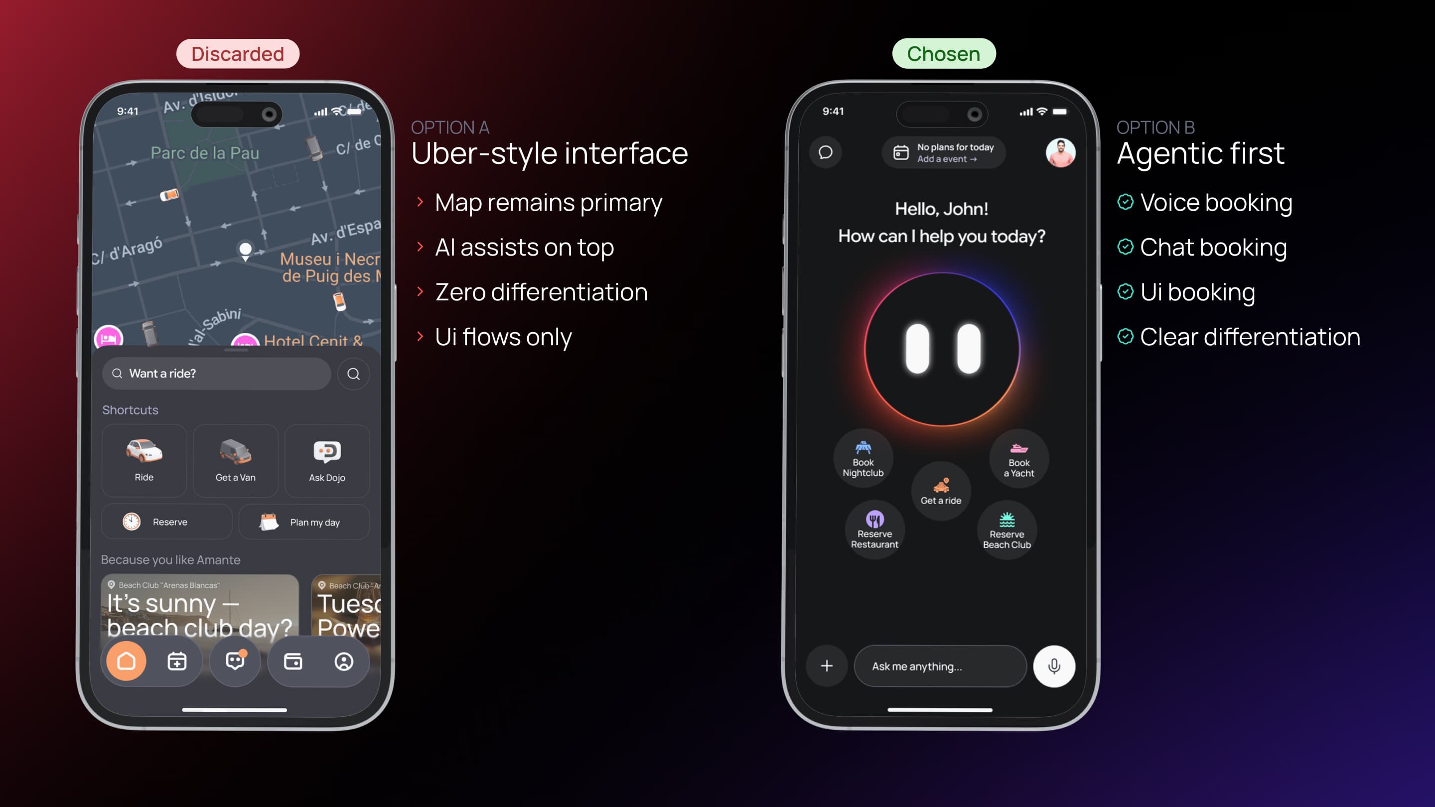
UX architecture
The Customer App had four interconnected systems: rideshare, experience booking, calendar/event logic, and interaction modes. The core insight was identifying what was universal (party size, date, time, availability, confirmation) and what was service-specific (location for rideshare, menu preferences for dining, guest count for yachts, etc.).
Customer App
One booking engine, four systems, three modes
Rideshare system
User requests a taxi via Voice/Chat/UI
System shows available drivers in real-time on map
User confirms; driver assigned
Real-time tracking until ride completes
Experience booking
User requests booking (restaurant, yacht, etc.)
System shows available venues matching criteria
User selects and confirms
System handles payment
Calendar / event system
All bookings (rides + experiences) appear as events
System detects consecutive events at different locations
Automatically suggests rides to connect them
Merges cards into Connected variant when ride booked
Interaction modes
Voice Mode — hold-to-talk with options
Chat Mode — text with option cards
UI Flow — stepped, filterable, traditional
All three converge on same confirmation
Final solution
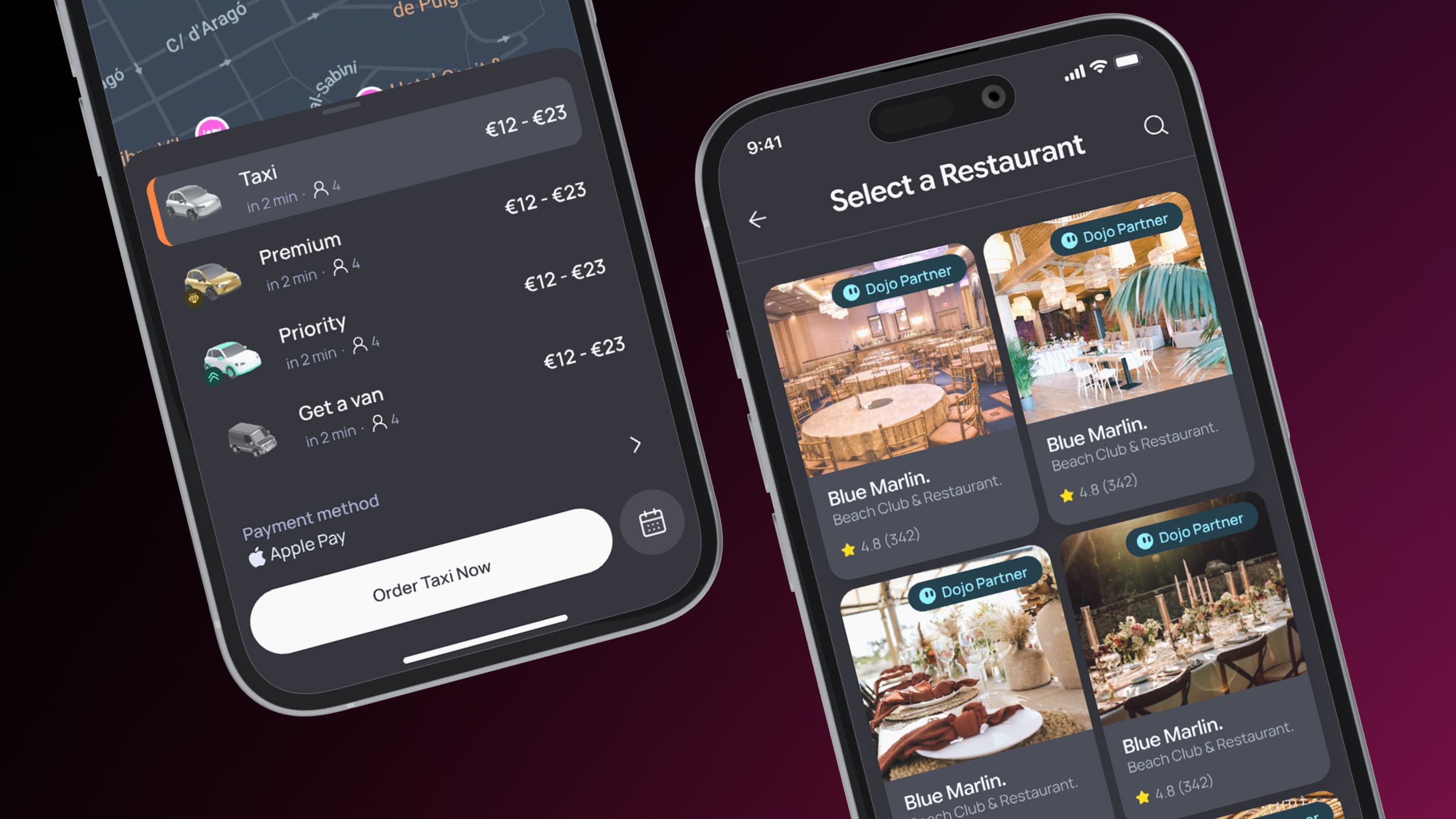
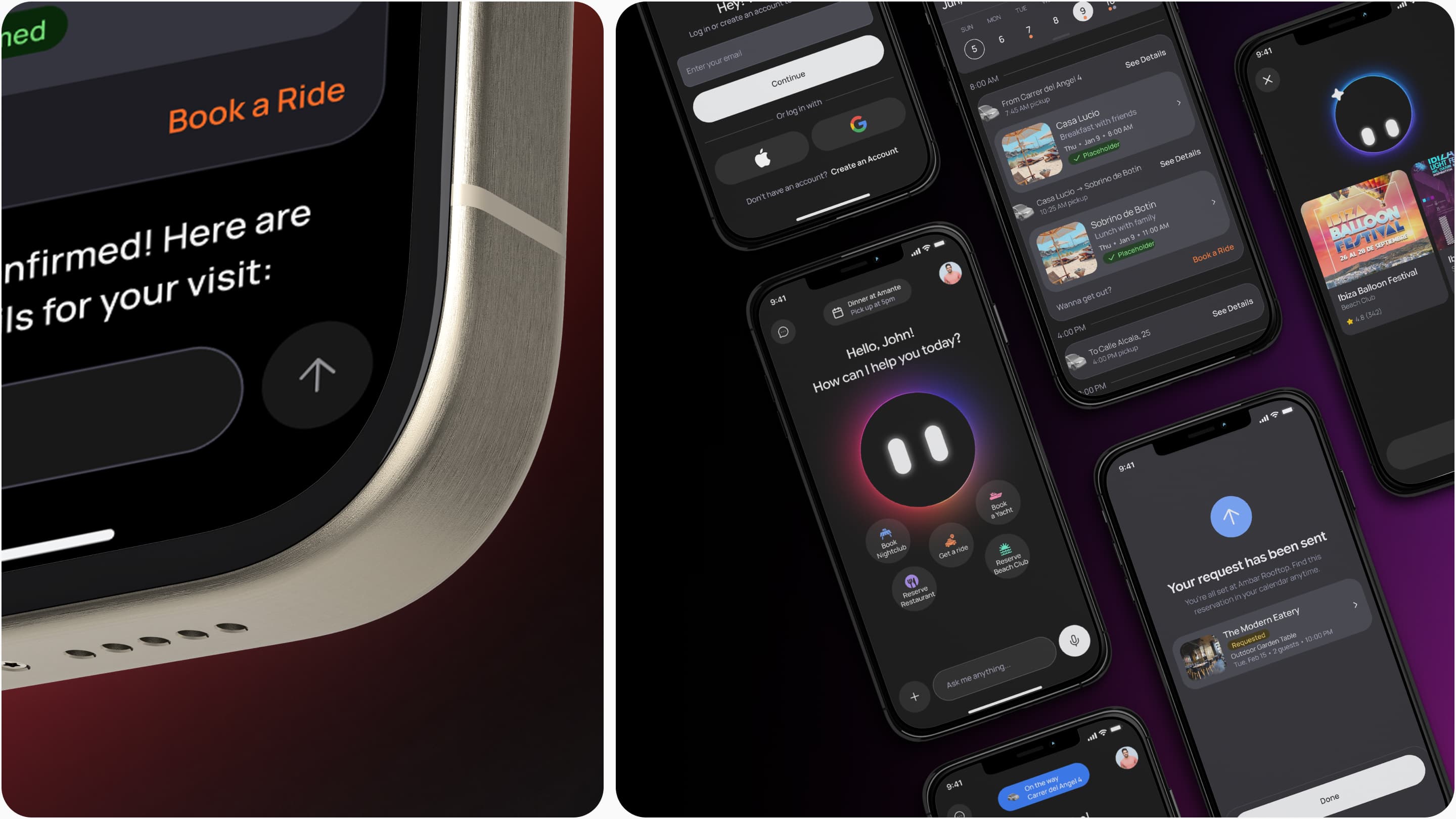
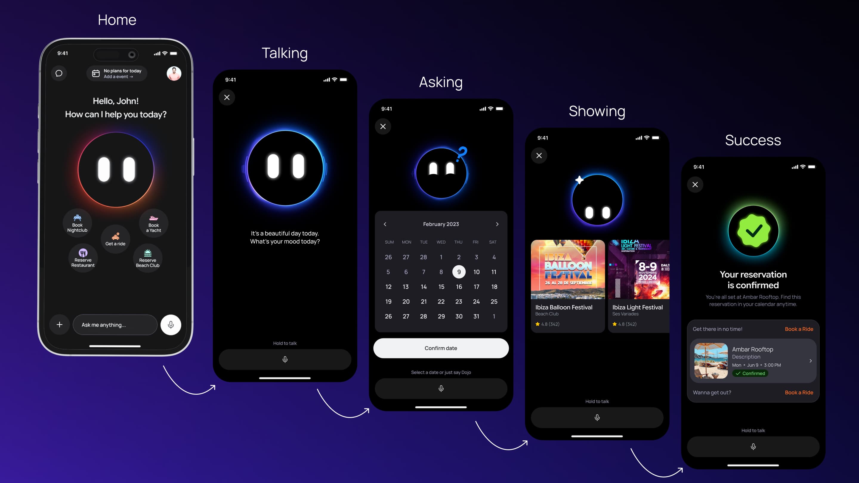
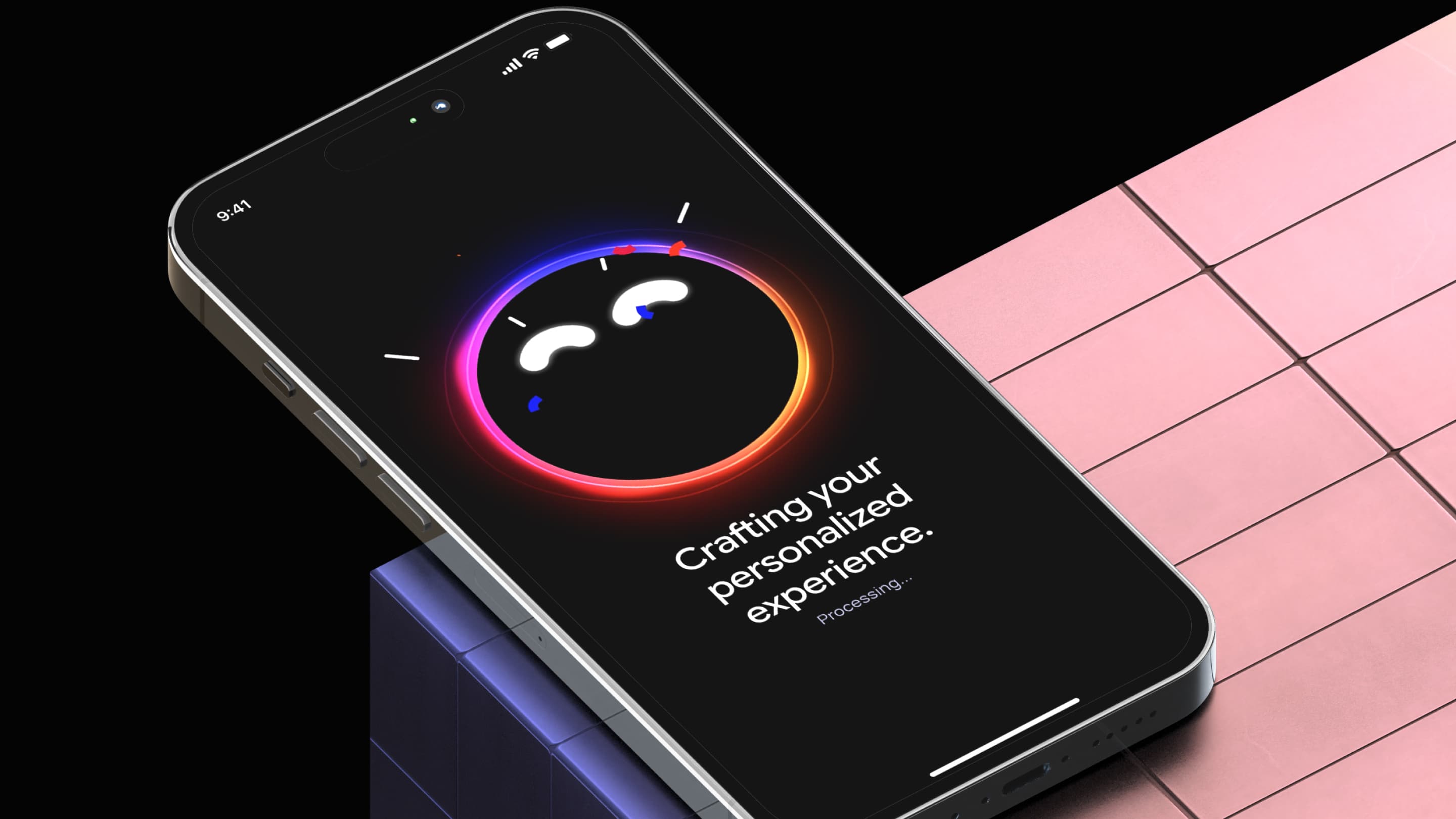
Voice Mode: Dojo as the visible agent
Voice Mode's design centered on making Dojo feel alive and present. The app opens to a full-screen Dojo avatar (animated, responsive). When the user holds to talk and speaks ("I need a taxi to Pacha"), Dojo processes the request. While processing, the avatar pulses (visual feedback). Once processed, Dojo responds via text-to-speech and simultaneously displays options as UI cards below the avatar (driver cards showing vehicle, driver name, rating, ETA).
The avatar's size and position change based on state: centered and large when idle, shrunk and moved up when options appear (to make room for cards). This animation signals that the conversation is moving into a selection phase. Users can then tap a card to confirm or keep speaking ("Give me the one with the best rating").
Once a driver is assigned, the app transitions to a real-time map showing driver location, user location, route, and ETA. A sheet below (collapsible) shows ride details without hiding the map.
The Mascot
The CEO's brief was simple: "Dojo needs to feel like your pal." This shifted the design perspective. Dojo wasn't just an avatar—it was the personality layer of Voice Mode, the visual embodiment of the agent.
I designed a state machine that mapped Voice Mode interactions to approximately 10 distinct visual states. Each state signaled what the system was doing: listening, processing, responding, displaying options, confirming selections, handling errors. I worked with a Rive animator to translate this logic into interactive animations. Dojo expressed state through eye movement and body color shifts—no complex expressions, just clear visual feedback.
Triggers in the codebase fired state transitions: user presses "Hold to Talk" → Listening state, speech-to-text processes → transition to Idle, backend returns options → Talking state, user taps selection → Confirming state. Dojo wasn't animated on a timer; Dojo responded to actual events. This made Voice Mode real conversation, not a system talking at you.
Chat Mode: Conversational without voice
Chat Mode is straightforward. User taps a chat input at the bottom of the home screen and types. Dojo responds in text. Below Dojo's message, option cards appear (drivers, restaurants, venues, pricing).
User can tap cards or type follow-ups ("More expensive options," "Closer to my location," "Which one has the best reviews?"). The conversation history scrolls; users always see the context.
For rideshare, once a driver is assigned, the app transitions to the same map view as Voice Mode. For experience bookings, confirmation and payment are handled via standard form flows (date, time, party size, payment).
UI Flow: Traditional booking, premium treatment
UI Flow is for users who prefer browsing and control. Home screen has a menu option to enter UI Flow.
User is presented with service categories: Get a Ride, Reserve Restaurant, Book a Yacht, Book Beachclub, Book Nightclub.
Visual treatment: UI Flow has an elevated background (light gray or white, vs. dark for Voice/Chat). More breathing room. Step indicators. Clear button states. Filters are persistent.
Calendar with Connected Events
The calendar acted as the organizational backbone of the Customer App, unifying rides and experience bookings into a single timeline-based system. Its core innovation was the connected event logic, which detected consecutive bookings across different locations and intelligently suggested rides between them based on timing and destination context.
When a logical connection existed, the system automatically calculated optimal pickup and dropoff points using the previous and upcoming reservations, then surfaced ride suggestions directly within the booking flow. Once confirmed, the calendar visually grouped the related reservations and transportation into a single connected experience, making the app feel context-aware rather than a collection of isolated transactions.
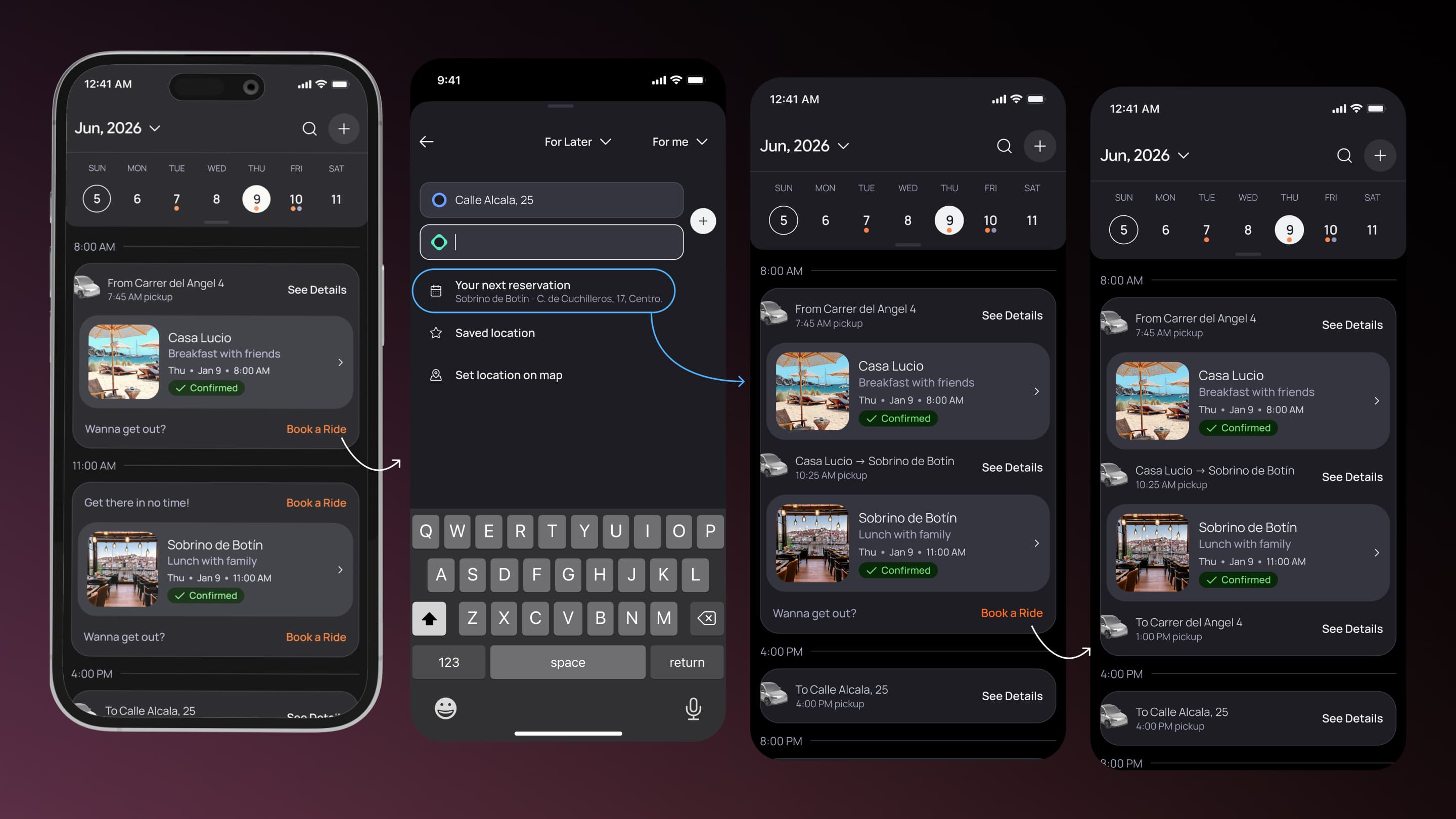
Real-time Rideshare Tracking and Pill Component
Once a ride was confirmed, the app transitioned to a full-screen map view. The map showed user's location (blue dot), driver's location and direction (car icon with arrow), calculated route (blue line), ETA to pickup (large text at top), and distance.
Below the map, a collapsible sheet showed driver name and rating, vehicle make/model, current status ("Driver is 2 minutes away"), message button (tap to text the driver), and cancel ride button.
The map updated in real-time: driver position, ETA, distance all refreshed every 5 seconds.
Pill component: On the home screen, a pill-shaped component near the top showed the next upcoming event (venue name, time, location). When a ride was in progress, the pill changed state: blue background, showing ride status ("Driver arriving in 2 min," "On your way to Pacha," "Arriving in 3 min"). Tapping the pill navigated to the map view.
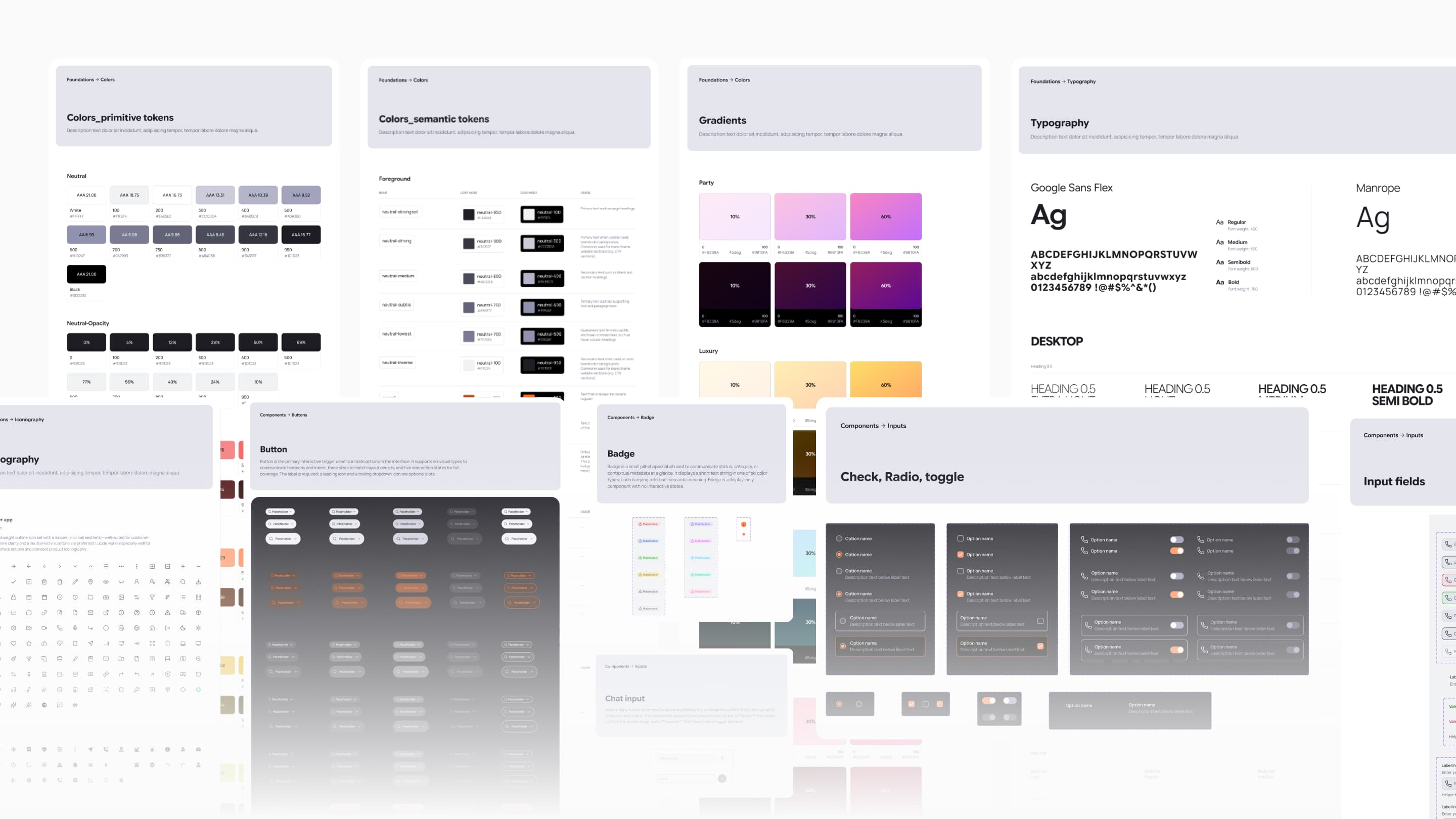
Design System / Design Engineering
The Customer App used a dedicated design system built on top of the broader helloDojo design system, combining shared foundations with app-specific interaction patterns tailored to rideshare, nightlife, booking flows, maps, and conversational experiences. The system defined consistent responsive behaviors, interaction states, motion patterns, accessibility rules, and transition logic to ensure all three interaction modes — Voice Mode, Chat Mode, and UI Flow — felt cohesive rather than fragmented.
From an engineering perspective, the system was designed around a tight design-to-code workflow. Component specifications in Figma included prop documentation, behavioral definitions, state combinations, and usage rules, while a custom Figma MCP integration allowed AI coding assistants to read component structures, constraints, and design tokens directly from the source files. Complex behaviors such as real-time updates, animated transitions, fallback states, and connected booking logic were documented with implementation-level detail to ensure frontend behavior matched the intended UX.
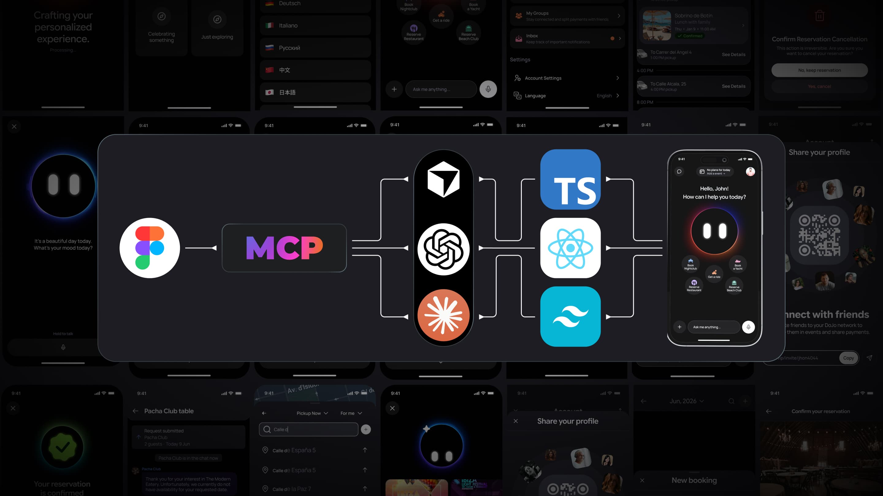
Frontend / Implementation Layer
The Customer App was built in React Native using an AI-assisted development workflow that combined Claude Opus for planning, GPT for code review, and Sonnet/Codex for implementation support. The technical stack included TypeScript, NativeWind, TanStack Query, Zustand, WebSockets, and integrations for maps, voice interaction, and payments, creating a scalable foundation for real-time and multi-modal experiences across iOS.
The product architecture revolved around three connected interaction systems: Voice Mode, Chat Mode, and traditional UI flows, each operating through dedicated state logic while remaining part of the same unified experience. Features like connected event detection, ride suggestions between reservations, and real-time map updates relied on synchronized frontend state and live backend communication to keep the experience context-aware and operationally reliable.
The design-to-code workflow depended heavily on Figma MCP integration, allowing AI tooling to generate frontend code directly from structured design specifications while preserving token consistency, interaction behaviors, and responsive layouts. Quality control focused on regression prevention, real-time performance, voice interaction reliability, connected event logic validation, and maintaining consistent UX behavior across all three interaction modes.
Collaboration
The team was small: me (design + frontend) and the CTO (backend/infrastructure). No product manager. Fast decision-making, but also high risk.
With the CTO: I worked closely to translate product logic into APIs. When I designed Voice Mode with tool calls, the CTO had to implement NLP processing and tool call integration. When I designed connected events, the CTO had to implement the detection logic, ride suggestion, and calendar merging on the backend. When I designed real-time map tracking, the CTO had to set up WebSockets and optimize for 5-second update intervals.
We aligned on data structures early: what information the backend needed to return for each API call, what states the app would manage, what validation would happen server-side vs. client-side. Clear product specs (flows, states, edge cases) reduced rework.
Frontend workflow: I built the app in React, using AI-assisted code generation. I managed Figma-to-code via MCP integration: design specs in Figma → AI reads them → generates code → I review for quality → iterate. The CTO reviewed major architectural decisions but didn't review every component.
Iteration: Because we shipped everything at once (all 5 service categories), there was limited iteration based on user feedback. Changes were made in response to QA findings (two weeks before launch) and edge cases discovered during implementation, not from user testing.
Results and impact
The Customer App shipped to TestFlight with all three interaction modes fully operational, including Voice Mode, Chat Mode, and traditional UI flows working under a unified interaction system. The platform successfully supported real-time rideshare tracking, intelligent booking connections, conversational interactions, and a unified calendar experience capable of organizing rides, restaurants, yachts, beachclubs, and nightlife reservations within a single application.
One of the most impactful outcomes was the implementation of the connected event logic, which allowed the system to understand relationships between consecutive bookings and automatically suggest rides between destinations. Instead of treating reservations as isolated transactions, the app behaved more like an intelligent concierge that understood the context of an entire night, making the experience feel significantly more cohesive and adaptive than traditional booking platforms.
The project also established a strong frontend and design system foundation for future scaling. The Customer App introduced reusable components, shared tokens, responsive behaviors, real-time interaction patterns, and AI-assisted development workflows that enabled consistent UX across all interaction modes. By unifying five distinct service categories under a single product logic and conversational paradigm, the app demonstrated how complex operational systems could feel simple, connected, and context-aware for end users.
What I Would Improve
The next major priority would be validating the core assumptions behind the multi-modal interaction model, especially around Voice Mode usage in real environments. Without production analytics or user testing, it remains unclear whether users would genuinely prefer voice interaction or naturally fall back to Chat and traditional UI flows during busy nightlife scenarios. A beta launch with instrumentation around mode switching, completion rates, and failure points would help validate whether voice feels truly valuable or simply novel.
I would also refine the platform’s connected event intelligence by incorporating real-world context such as travel times, traffic conditions, and Ibiza-specific transportation patterns. Additional iteration on contextual UI elements, chat performance during long sessions, and more advanced accessibility auditing would improve usability across high-pressure environments and longer user journeys. Ensuring the Dojo assistant maintained a consistent personality across all interaction modes would also strengthen the product identity.
From a product strategy perspective, I would move toward more service-specific booking flows instead of using one generalized interaction structure across all categories. Restaurants, yachts, beachclubs, and nightlife each involve different booking expectations and constraints that deserve tailored UX patterns. I would also recommend a more phased rollout strategy, launching rideshare first and progressively layering additional services afterward to validate interaction models, reduce operational complexity, and iterate on the platform with real user behavior before scaling the ecosystem further.
Final reflection
The Customer App proved that I can design and build complex, multi-mode interactions at scale. Voice Mode required thinking beyond "pretty UI" into agent design, tool call visualization, state transitions, and fallback behavior. Connected events required defining clear product logic upfront and translating it into code. Real-time tracking required performance thinking and network resilience.
The three-mode design—Voice, Chat, UI Flow—is the strongest evidence of product thinking. Rather than building a voice-only app (risky, niche) or a traditional Uber clone (no differentiation), I created three paths that serve different contexts, all unified under Dojo and the same booking logic. This is what it means to think about the full range of user contexts, not just the happy path.
The work demonstrates:
- Product thinking: "Agent focus" translated into three distinct modes, not just voice. Recognizing that Ibiza's context required flexibility was a product decision.
- UX architecture: Managing three modes, five service categories, real-time state, and calendar logic required clear flows, state machines, and edge case mapping.
- Design engineering: Components, tokens, and variants had to scale across modes. Voice UI required specific animations and states. Map required performance optimization. Connected events required clear visual design to show relationships.
- Frontend implementation: Building production React code, managing real-time updates, translating Figma specs into code via MCP, handling three distinct interaction paradigms in one codebase.
- Shipping under constraint: 6 months, two-person team, no user research, technical unknowns with voice, complex event logic, parallel shipping of five service categories—and still delivering a coherent, production-ready app.
The Customer App's ability to unify rideshare, dining, yachts, beachclubs, and nightlife under one interface with three interaction modes, connected event logic, and real-time tracking is the proof. This is not a feature; this is a system.
Next case study
UMA Agent